


Online forms make it easy to gather information, generate leads, take orders, get customer feedback, etc. Your forms need to be functional to take advantage of this convenience.
Otherwise, you’ll miss out on submissions. People won’t hang around if your forms aren’t working correctly. We’ve created this guide to form testing so that you get the most out of your online forms. Because fully functional forms get higher submissions and conversions.
Please note: I’m using a simple contact form template to create a form for this guide.
Once you’re in the form builder, simply preview your form by clicking the preview button in the top right corner. You can test your form’s functionality in preview mode.
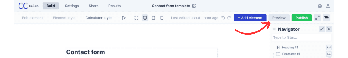
This opens up a new tab with a preview of your form.

Testing Form Functionality
In the form preview, I recommend testing the following:
Form field validation
Error handling
Form submissions
Submission notification emails
Form completion message
Various device functionality
Overall user experience
1. Form field validation
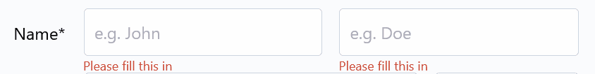
Validating form fields ensures users provide accurate and complete information. This is crucial for data quality and user experience. Form validation means an error message appears on the form when a user tries to submit it without completing any required fields. I submitted my form in the preview without entering details for a name field and got a prompt to complete the field.
An error should also appear if you enter an incorrect input format for an email field. Although the below statement is true, it isn’t a valid input for an email address, so I rightly get an error message.
The same will also happen for an invalid phone number field and incorrect formatting in a date field. Here are some other things you can check:
Character limit validation - You might set maximum and minimum character limits for text fields to prevent users from entering excessively long or short responses. It’s a good idea to display character counts if you use them and provide relevant errors messages if users exceed them.
Numeric validation - If you’re collecting numeric data such as age, quantity, or monetary values, validate that the input consists of valid numbers and falls within acceptable ranges.
Dropdown validation - Ensure users can make valid selections on dropdown menus and test this in the form preview. Making it clear users must choose a dropdown option guides them through the form.
Providing clear guidelines on the form and error messages when necessary is best practice. When validation fails, clear messaging ensures users know what information they need to complete to submit the form.
2. Error handling
Testing error handling checks that your online forms effectively guide users through the submission process and provide clear feedback when errors occur.
In the preview, I deliberately input an invalid phone number.
The invalid input triggered the error message below the form field. That lets me know the error handling works correctly for this field.
You can do this throughout the form to ensure error messages appear when needed. Try inputting numbers below minimums and above maximums to see how the form reacts. Use special characters or go over the character limit in text fields to test error handling.
The way you use error messages is also important.
Clarity and consistency - Evaluate the clarity and consistency of the error messages you display to users. Ensure that error messages clearly indicate what went wrong and provide actionable guidance on how to correct the error. Use consistent language and formatting across all error messages to maintain a cohesive user experience. Convert_ already has default error messages. You can change these if you want, though.
Click on settings in the form builder:
Go to the messages tab next:
Change the list of messages here if you like:
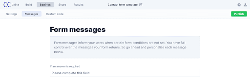
There are 27 form messages that you can personalize to your liking. I changed the first one on my form, and now I get a different error message:
Placement and visibility - Checking where the error messages appear and if they stand out is also crucial. Users must be able to see them so they know completing these fields is compulsory.
Convert_ ensures error messages are displayed near the corresponding form fields to make them easily noticeable to users. Errors are also displayed in red font to make them stand out.
3. Form submissions
Once you’ve tested the field validation and error handling, submitting a completed form in the preview is up next. I’ve completed a test form, so let’s see if it submitted correctly.
Go to the results tab from the form builder:
You will see my test submission here:
The red arrow pointing to “Export” lets you download all your submissions as a CSV file. This is handy for collecting contact details when users submit your form.
Nothing went wrong with the submission, and it appeared in the results tab super fast.
4. Submission notification emails
You should get an email notification when you submit a form in the preview tab. I immediately got my email notification for the test submission:
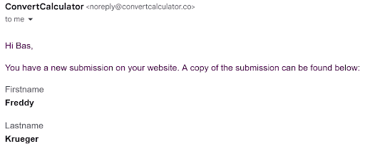
You may have noticed this email addresses Bas, who is the co-founder of Convert_. Bas is a really nice guy, but I want the submission emails to address me - you probably want the same - so I’m going to change this.
In the form builder, click on the button section at the bottom of your form:
This opens the button settings on the left side of the form builder. Scroll down until you see Actions:
Click on the first action - Send Submission Email - which opens a new window on the right:
The email address for the submission emails defaults to the one you signed up to Convert_ with. But you can edit this if you want submission emails sent to another address, and you can add more email addresses to receive submission notifications.
Scrolling down lets you change other details like email subject line and message:
Now, submission notification emails address me instead of Bas.
5. Form completion message
You want to make sure users get a message when they complete your form. Editing a completion message is easy in the form builder. We’ll stay in the button settings we used in the previous section.
Scroll to the Response Message, which is located above Actions:
Simply write your personalized response message here as I did. Then, complete another test form to make sure your message shows upon submission.
You might want to send users to a thank you page when they submit your form. That’s also easy.
Go to Actions again and click on Link to External Page:
Paste in your thank you page link and then complete another test submission to ensure it works.
6. Various device functionality
Testing various device functionality means you won’t be caught short when people submit your forms on different devices. It’s always a good idea to test functionality for desktops, tablets, and smartphones. Convert_ makes this process simple.
The form preview has desktop, tablet, and smartphone icons:
Run through all of the previous tests in each view. This ensures your form will function perfectly no matter what device users view it on.
7. Overall user experience
You’ve tested the functionality, and your form’s working well. Now, you want to turn your attention to the overall user experience. Ensuring a great user experience increases your chances for more form submissions and conversions. Excellent functionality puts you well on the road to nailing the overall user experience.
You might want to focus on some additional aspects of your form, though.
Form length
Clarity of instructions
Field grouping and organization
Form length
A long form can be the kiss of death for a good user experience. Taking users on a seemingly never-ending form-filling journey often leads to abandonment - they’ll pull the eject cord and bail.
It’s always a good idea to keep forms as short as possible. If you need to take people on that journey, you can guide them through the form with:
Multi-page forms - Convert_ lets you create multi-page forms to increase the chances of people filling out long forms. Setting up multi-page forms properly provides a natural flow for users, limiting the need to scroll and seamlessly guiding them to the next page.
Show/hide fields -Show or hide fields based on previous answers, so people only need to complete relevant fields. The form length adjusts automatically based on a user's input. This results in forms that are complex under the hood but simple for people to complete, improving the user experience.
Clarity of instructions
Include clear and actionable instructions for each form field. This guides users on what information they must include in the form. Descriptive labels and placeholder text indicate the expected format or type of input people should enter.
Providing examples or hints for complex or ambiguous fields helps users understand what information to enter. Tooltips or inline help text offer additional guidance if needed.
Field grouping and organization
Create forms with a logical flow by grouping and organizing sections based on related information. Grouping related fields like personal information and contact details streamlines the form's layout and makes it easier for users to navigate.
Visual cues such as spacing, borders, or background colors for different sections also help.
Conclusion
Form functionality is critical for your form submission success. Whether you’re collecting information, generating leads, taking orders, or getting customer feedback, you need people to complete your forms.
Luckily, testing form functionality is easy when you know what to look for. Following this form testing guide will set you up for higher submissions and conversions.
Quick recap of what to test:
Form field validation
Error handling
Form submissions
Submission notification emails
Form completion message
Various device functionality
Overall user experience
Why not log into Convert_ and put your forms through their paces?
Online forms make it easy to gather information, generate leads, take orders, get customer feedback, etc. Your forms need to be functional to take advantage of this convenience.
Otherwise, you’ll miss out on submissions. People won’t hang around if your forms aren’t working correctly. We’ve created this guide to form testing so that you get the most out of your online forms. Because fully functional forms get higher submissions and conversions.
Please note: I’m using a simple contact form template to create a form for this guide.
Once you’re in the form builder, simply preview your form by clicking the preview button in the top right corner. You can test your form’s functionality in preview mode.
This opens up a new tab with a preview of your form.
Testing Form Functionality
In the form preview, I recommend testing the following:
Form field validation
Error handling
Form submissions
Submission notification emails
Form completion message
Various device functionality
Overall user experience
1. Form field validation
Validating form fields ensures users provide accurate and complete information. This is crucial for data quality and user experience. Form validation means an error message appears on the form when a user tries to submit it without completing any required fields. I submitted my form in the preview without entering details for a name field and got a prompt to complete the field.
An error should also appear if you enter an incorrect input format for an email field. Although the below statement is true, it isn’t a valid input for an email address, so I rightly get an error message.
The same will also happen for an invalid phone number field and incorrect formatting in a date field. Here are some other things you can check:
Character limit validation - You might set maximum and minimum character limits for text fields to prevent users from entering excessively long or short responses. It’s a good idea to display character counts if you use them and provide relevant errors messages if users exceed them.
Numeric validation - If you’re collecting numeric data such as age, quantity, or monetary values, validate that the input consists of valid numbers and falls within acceptable ranges.
Dropdown validation - Ensure users can make valid selections on dropdown menus and test this in the form preview. Making it clear users must choose a dropdown option guides them through the form.
Providing clear guidelines on the form and error messages when necessary is best practice. When validation fails, clear messaging ensures users know what information they need to complete to submit the form.
2. Error handling
Testing error handling checks that your online forms effectively guide users through the submission process and provide clear feedback when errors occur.
In the preview, I deliberately input an invalid phone number.
The invalid input triggered the error message below the form field. That lets me know the error handling works correctly for this field.
You can do this throughout the form to ensure error messages appear when needed. Try inputting numbers below minimums and above maximums to see how the form reacts. Use special characters or go over the character limit in text fields to test error handling.
The way you use error messages is also important.
Clarity and consistency - Evaluate the clarity and consistency of the error messages you display to users. Ensure that error messages clearly indicate what went wrong and provide actionable guidance on how to correct the error. Use consistent language and formatting across all error messages to maintain a cohesive user experience. Convert_ already has default error messages. You can change these if you want, though.
Click on settings in the form builder:
Go to the messages tab next:
Change the list of messages here if you like:
There are 27 form messages that you can personalize to your liking. I changed the first one on my form, and now I get a different error message:
Placement and visibility - Checking where the error messages appear and if they stand out is also crucial. Users must be able to see them so they know completing these fields is compulsory.
Convert_ ensures error messages are displayed near the corresponding form fields to make them easily noticeable to users. Errors are also displayed in red font to make them stand out.
3. Form submissions
Once you’ve tested the field validation and error handling, submitting a completed form in the preview is up next. I’ve completed a test form, so let’s see if it submitted correctly.
Go to the results tab from the form builder:
You will see my test submission here:
The red arrow pointing to “Export” lets you download all your submissions as a CSV file. This is handy for collecting contact details when users submit your form.
Nothing went wrong with the submission, and it appeared in the results tab super fast.
4. Submission notification emails
You should get an email notification when you submit a form in the preview tab. I immediately got my email notification for the test submission:
You may have noticed this email addresses Bas, who is the co-founder of Convert_. Bas is a really nice guy, but I want the submission emails to address me - you probably want the same - so I’m going to change this.
In the form builder, click on the button section at the bottom of your form:
This opens the button settings on the left side of the form builder. Scroll down until you see Actions:
Click on the first action - Send Submission Email - which opens a new window on the right:
The email address for the submission emails defaults to the one you signed up to Convert_ with. But you can edit this if you want submission emails sent to another address, and you can add more email addresses to receive submission notifications.
Scrolling down lets you change other details like email subject line and message:
Now, submission notification emails address me instead of Bas.
5. Form completion message
You want to make sure users get a message when they complete your form. Editing a completion message is easy in the form builder. We’ll stay in the button settings we used in the previous section.
Scroll to the Response Message, which is located above Actions:
Simply write your personalized response message here as I did. Then, complete another test form to make sure your message shows upon submission.
You might want to send users to a thank you page when they submit your form. That’s also easy.
Go to Actions again and click on Link to External Page:
Paste in your thank you page link and then complete another test submission to ensure it works.
6. Various device functionality
Testing various device functionality means you won’t be caught short when people submit your forms on different devices. It’s always a good idea to test functionality for desktops, tablets, and smartphones. Convert_ makes this process simple.
The form preview has desktop, tablet, and smartphone icons:
Run through all of the previous tests in each view. This ensures your form will function perfectly no matter what device users view it on.
7. Overall user experience
You’ve tested the functionality, and your form’s working well. Now, you want to turn your attention to the overall user experience. Ensuring a great user experience increases your chances for more form submissions and conversions. Excellent functionality puts you well on the road to nailing the overall user experience.
You might want to focus on some additional aspects of your form, though.
Form length
Clarity of instructions
Field grouping and organization
Form length
A long form can be the kiss of death for a good user experience. Taking users on a seemingly never-ending form-filling journey often leads to abandonment - they’ll pull the eject cord and bail.
It’s always a good idea to keep forms as short as possible. If you need to take people on that journey, you can guide them through the form with:
Multi-page forms - Convert_ lets you create multi-page forms to increase the chances of people filling out long forms. Setting up multi-page forms properly provides a natural flow for users, limiting the need to scroll and seamlessly guiding them to the next page.
Show/hide fields -Show or hide fields based on previous answers, so people only need to complete relevant fields. The form length adjusts automatically based on a user's input. This results in forms that are complex under the hood but simple for people to complete, improving the user experience.
Clarity of instructions
Include clear and actionable instructions for each form field. This guides users on what information they must include in the form. Descriptive labels and placeholder text indicate the expected format or type of input people should enter.
Providing examples or hints for complex or ambiguous fields helps users understand what information to enter. Tooltips or inline help text offer additional guidance if needed.
Field grouping and organization
Create forms with a logical flow by grouping and organizing sections based on related information. Grouping related fields like personal information and contact details streamlines the form's layout and makes it easier for users to navigate.
Visual cues such as spacing, borders, or background colors for different sections also help.
Conclusion
Form functionality is critical for your form submission success. Whether you’re collecting information, generating leads, taking orders, or getting customer feedback, you need people to complete your forms.
Luckily, testing form functionality is easy when you know what to look for. Following this form testing guide will set you up for higher submissions and conversions.
Quick recap of what to test:
Form field validation
Error handling
Form submissions
Submission notification emails
Form completion message
Various device functionality
Overall user experience
Why not log into Convert_ and put your forms through their paces?
Continue reading


More leads in less time_
Start building the future of your company, today
Create powerful on brand calculators, lead generation forms and apps that automate your marketing and sales processes
Start with a template
Find inspiration or customize an outstanding template, complete with functional formulas and flows to help you get started.
Let us build for you
We can build your calculator, and afterwards you can always make changes yourself. Our service starts at just $250.